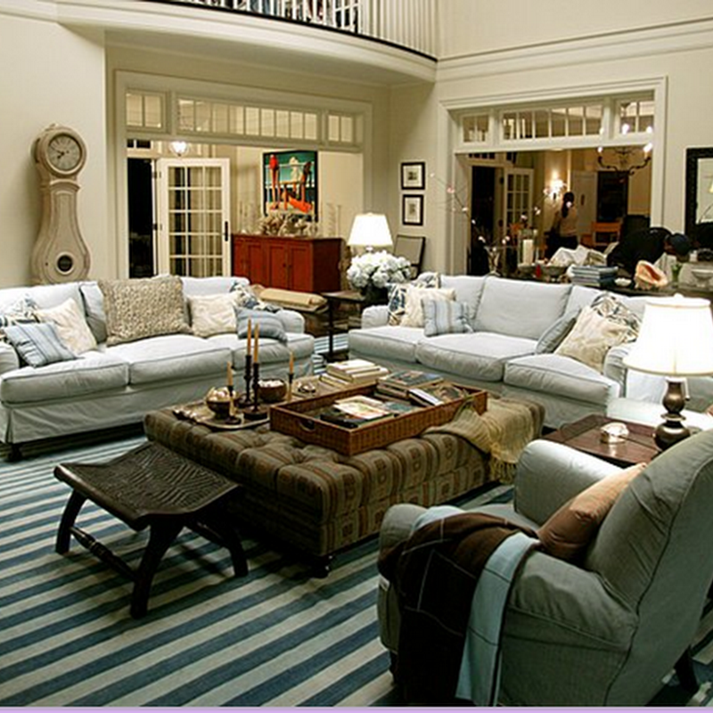
I look forward every month to my new issue of Elle Decor. I have to say, it is one of the best publications out there. I was very excited to see that the cover of the September issue had a home by one of my favorite designers Victoria Hagan. I love her understated classic design sensibility. I noticed there were a few differences between the cover and the editorial photos however. So I thought it would be fun to play a little game:
"What's Wrong with this Picture?"

Of course there is nothing intrinsically "wrong" with either picture. They are both wonderful. But the object of the game is to name all of the differences.
I'd love to hear your list, and your thoughts as to why the rooms are so different. There has been a bit of blogging about the importance of good photography lately, and I think staging is also important for photo composition. But do you think the cover was the real deal or the editorial? Which look do you prefer?
(Here are a few of my catches: drapery color, pillow color, throw on sofa arm, table gone to left of fireplace. table lamps, floor lamp missing, different side table, lounge chair missing, flowers on coffee table, wood in fireplace. Did you catch any others?)
HOLD THE PRESSES!
Well I am truly without proper words! I have been visited by one of the most impressive women in the Shelter Magazine world, Margaret Russell. Elle Decor is and has been the magazine I look forward to most every month. It consistently puts out interesting, unique, beautiful editorials that capture my imagination. I love being introduced to new talented designers and innovative design. To receive a blog visit from the editor makes my day, my week, my...well, you get the picture. Ms. Russell (um, may I call you Margaret?) was kind enough to leave a comment to explain the cover shoot process so I am happy to post it for you all! And thank you Margaret for the visit! I hope you visit again!
MR said...
Hi all,This was a terrific posting. For the record, an editor/stylist is present at every ED shoot and we bring flowers, but that's about it. Covers sell magazines, and sometimes we move some things around in a room for a better cover shot to accommodate cover lines, and occasionally we will slightly alter an image or return to the location for a cover shoot, which is the case with Victoria Hagan's project in our September issue. The room made a good cover, but the original photo was a bit quiet. The real-life room is always featured in the article (as in this story and also the Randy Powers project in July/August), so this is not about subterfuge, it's simply to create a strong cover for the newsstand. And no one we've featured has ever had a word of complaint, only bloggers.By the way, I love your blog.—Margaret Russell
September 29, 2007 2:02 PM


