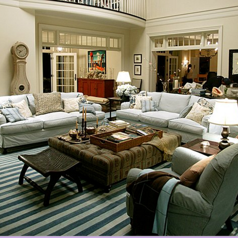
 I realized recently that I haven't been focusing on interiors as much so I thought it was about time I profiled the home of one of my favorite interior designers, Antonia Hutt. Or at least what her L.A. home looked like in May 2001 House Beautiful magazine. I've held onto the tear sheets for years because I loved her use of color. It's funny that Antonia Hutt claims not to have a favorite color since her home is filled with orange and my home contains not much orange at all even though it is my favorite color.
 It seems like nowadays, everyone has a Saarinen table and matching chairs but what really makes this set special is the blue leather cushions. I think the color is really beautiful against the white in her breakfast room. The Tommy Parzinger coffee set isn't too shabby either. And the "painting" is actually a rubbing of the tombstone of a medieval Scottish knight. How unique is that?!
 I'm sure most people would never dare pair purple and orange but in the right tones, it's very complimentary. I also love how she placed the sofas back to back which actually make the columns part of the design instead of an inconvenience.
 I love the painting Tangerine by Ray Richardson above the fireplace, one of the first Antonia Hutt ever bought, is a wonderful focal point and another use of orange.
 The orange plastic on the 1960's dining room chairs is yet another pop of orange and compliments the blue banquette. The photograph of what first appears to be a tree in winter is actually a photograph of a building being demolished and is another unique piece of art in the home.
 Antonia says the cream lacquered buffet by Tommy Parzinger reminds her of a Chanel handbag and is the perfect base for the 1970's aluminum lamps with orange shades. The tall mirror is a great vertical accent. If you notice, a lot of the art is tall and vertical and draws your eye upward. Even the shades in the bedroom below are another example.
I don't love the custom coral coverlet and shames on the bed. It's just not my style but other than that, I could move in tomorrow and be very happy. And that's my idea of great design. And what could be better than an orange filled home right before Halloween?!


