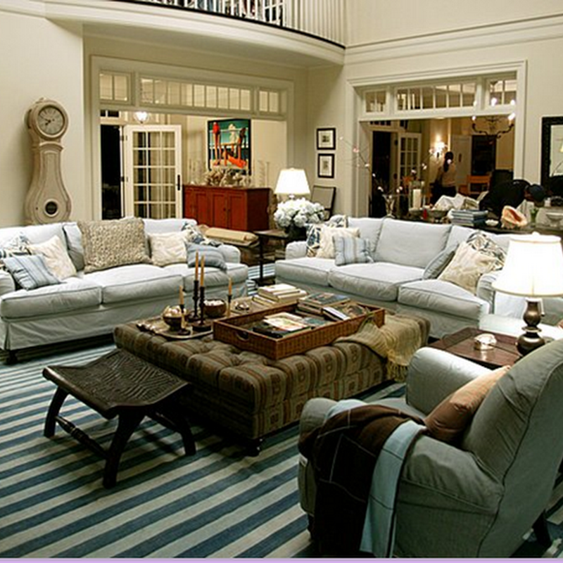
A shot of the living room looking towards the family room. Across from this arrangement is another seating group comprised of a tufted sofa and two more chairs.
In honor of Decorno's proposal that design bloggers celebrate "Original Content Week," I've dug into my archives and pulled out these shots of a highrise apartment that I worked on last year. My client is a single woman in her 80s with reddish brown hair and olive skin tones. Working around her coloring, I came up with the scheme of sage greens, terracottas, and caramels for her new space. My client looks wonderful in her condo because the colors blend with her complexion rather than fight it. This was the first time I had considered complexion in thinking up a color scheme and it is something I have continued to do. It was a real eureka moment in my design life and I highly recommend trying out the premise.
My client plays cards and lots of it and one of the most important aspects to get right were all the gaming tables. So, poker with the men, (and the ladies) takes place on the round, wooden dining table. We purchased a heavy, fold-up topper, backed with felt to cover the table when the chips are flying. Next, I purchased a smaller game table to seat four for a game of bridge. This worked beautifully until it was discovered that the mirror was reflecting the cards, so I designed a temporary cover out of the pillow fabric that is placed over the mirror when the bridge ladies come. I kid you not. Lastly, a larger game table that seats six was placed in the den to handle card games for between 4 and 8 players or to serve lunch on at all the games. Obviously, this is a woman who loves to entertain. Working on this assignment was challenging and took up the better part of a year. My client and I didn't know each other when we started, but by the end of the project we had become close friends, despite our 30 something years age difference.
 A closeup shot of the living room, with it's sage and terracotta tones. I designed all upholstery here and in the family room and had it fabricated at Custom Creations in Houston.
 A close up of the dining room. The light fixture is a beauty: a highly patinaed antique brass fixture from Belgium. The fixture was purchased at Brown, a unique lighting shop whose proprietor lived in Belgium for several years. Now back in Houston, she returns there several times a year for inventory. The light fixture is a stand out in the room - it's patina actually picks up the wall's color.
 This is the family room with caramel tones featured in the wall color, the Rose Tarlow fabrics, the drapery, and in the geometric patterned sisal rug. The brass and crystal light fixture is from Circa Lighting. The two brass lighting fixtures on opposite sides of the large space play off each other: though one is contemporary and the other antique, they complement each other. The set of prints are black and white drawings of Galveston, Texas that I had framed to cover the alcove space above the sofa. Janus et cie chairs surround the mid sized game table.


