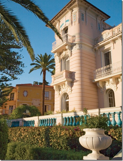
I'm dreaming of the beach and beach houses and apparently a lot of you are too, judging by the response to the Wheat's summer home. This lead to me wonder: how do the world's greatest interior designers decorate a summer home? First up, let's look at Nicholas Haslam. Though he has turned the reins of his design business over to Paulo Moschino, he took on this job of renovating an empty, decaying beach home on the Cote d'Azur for a couple who are previous clients. The large cream villa is their main house, the smaller ocher stuccoed home was next door. After eyeing it as it stood empty for many years, the house came on the market and the clients purchased it to use a guest house for family and visiting friends. The house came partially furnished along with a stash of Vogue's from previous decades. Both Haslam and the owner perused the fashion magazines for ideas for the soon to be refurbished guest house. Tops on their list for the guest house was that its design evoke the charm and elegance of the South of France from days gone by. I think they succeeded in their goal. And while you are admiring the house, just imagine the the luxury of not one, but two homes on Saint-Jean-Cap-Ferrat,France!
House #1
That's Villa Corrine, the "guest house" to the left of the ivory stone main house. The gardens of the two estates were melded into one after the neighboring property was purchased.
The grounds terrace down to the Mediterranean Sea.
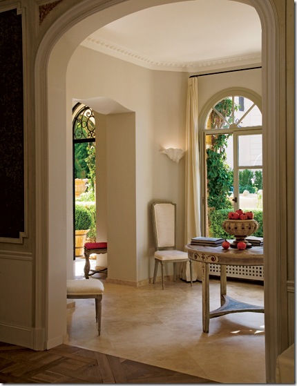
The entry hall with newly laid stone floor. The stone floors leads into the main area with its parquet wood floor.
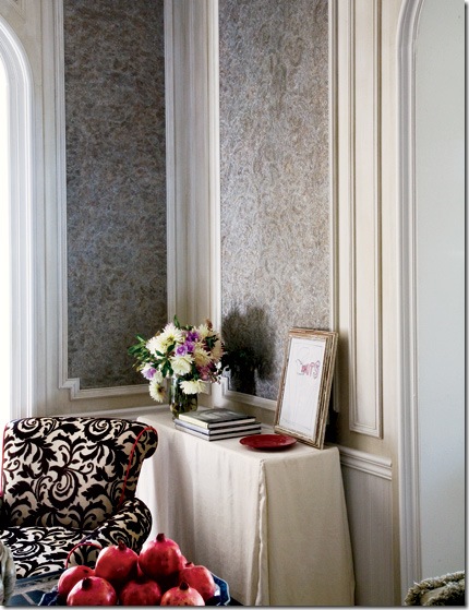
Haslam insisted the salon recall the glamour of days past at the South of France. He installed silvered lace panels on the walls which were in turn coated with mica. Haslam says the effect is greatest in the morning sun and during the night's candlelight. A simple linen slip covers a console table and a Manuel Canovas fabric is on the chair. Be sure notice the red piping on the black and white chair.
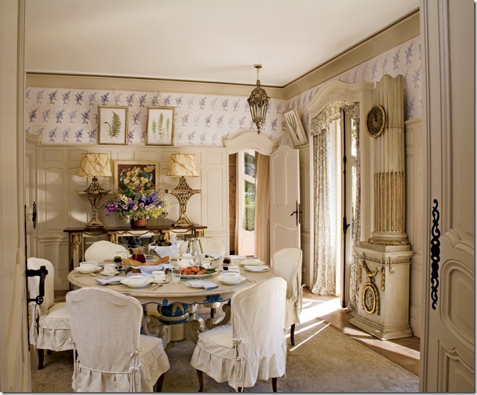
This is my favorite room in the house - of course! The chairs are covered in simple linen slips with dressmaker details. The wood walls were whitewashed and the tops of the walls were painted to resemble tile, which is such a great idea to incorporate into your own home!! The clock is just beautiful and is the focal point of the room. Note too the French carved doors.
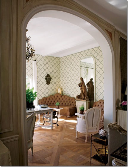
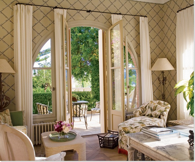
Haslam used the great interior designer Elsie De Wolfe as inspiration for the trellised wallpapered garden room. The chandelier is original to the house.
The garden room looks out onto the terrace.
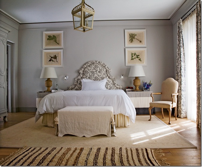
I love how Haslam used simple fabrics throughout. Here, again, linen slips cover the side tables and bench. The headboard and curtain fabrics are from Lee Jofa. The rug is Moroccan.
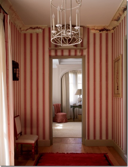
The vestibule to the bedroom has hand blocked red and white striped wallpaper. Haslam said since the adjoining bedroom is all white, he wanted a pop of color leading into it.
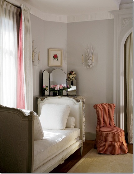
This antique painted French daybed came with the house. Haslam upholstered it in white matelasse.
House #2
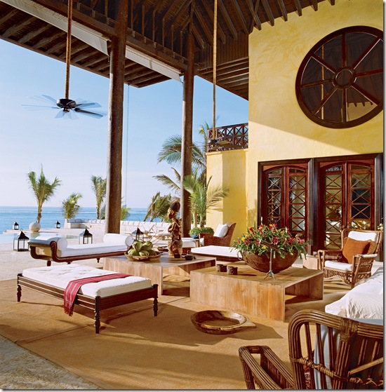
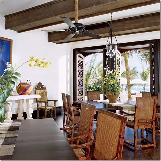
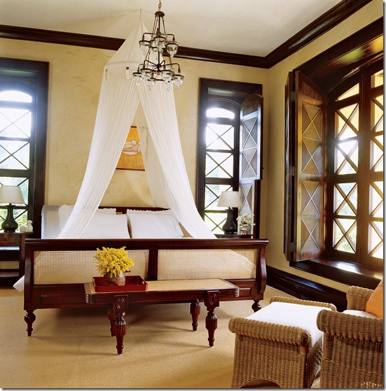
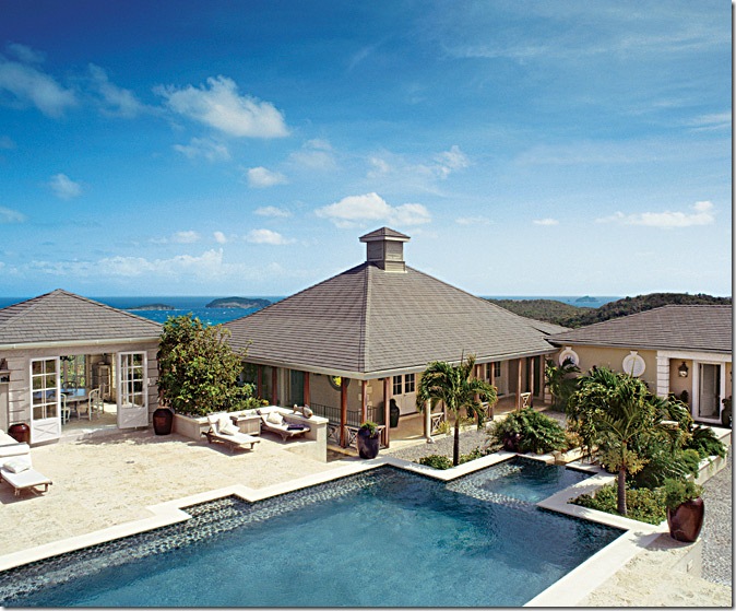
Next up, is a beach house designed by Juan Montoya. You may remember from last week, Mr. Montoya is not considered an Interior Designer by the state of Florida and the ASID and was sent a cease and desist letter by the state. Maybe if they could see these pictures, they would change their minds? This beach house is located on Punta Cana in the Dominica Republic in an enclave filled with VIPs, including Oscar de la Renta who put this beach on the international jet set's map. The house itself was designed by Montoya who also had all the furniture built to his specifications in the D.R. The entire structure is made of local stone, wood and stucco. Furnished in the British Colonial fashion, Montoya used dark woods and white fabrics. The home is open to the ocean which is visible from each room. Notice the gorgeous wood framed doors leading into the house, above.
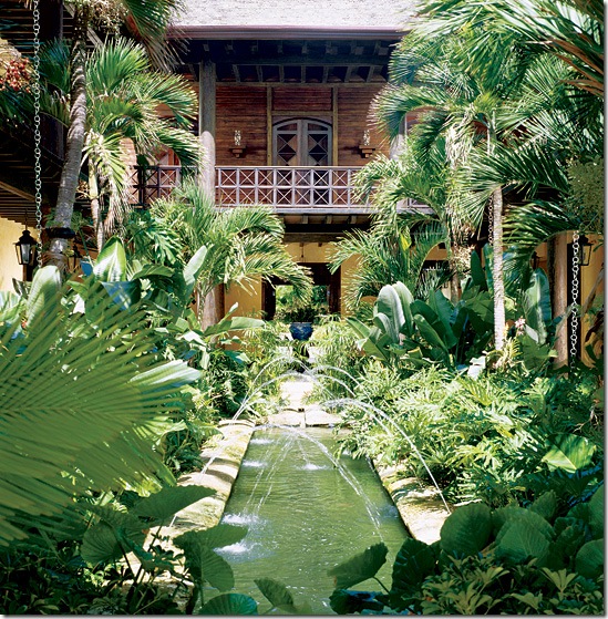
Not only did Montoya design the house and its furnishings, he also designed the landscape. Here in an interior courtyard, the fountains were built to resemble Spain’s Alhambra. Notice the x design of the balcony repeats the x design in the shown in the doors.
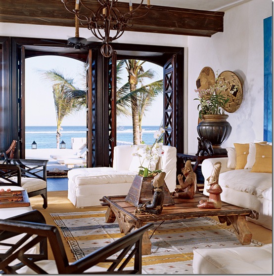
The living room has six sets of french doors opening to the outside. All have the x design motif which is repeated throughout the house. Massive upholstered furniture is slipcovered in white.
The dining room can seat up to 16 people. Beams were added for atmosphere.
The Anglo-Indian style furniture was all designed by Montoya and built on the island. There are five guest rooms. The x crossed windows have shutters with the x motif, again, to control the light.
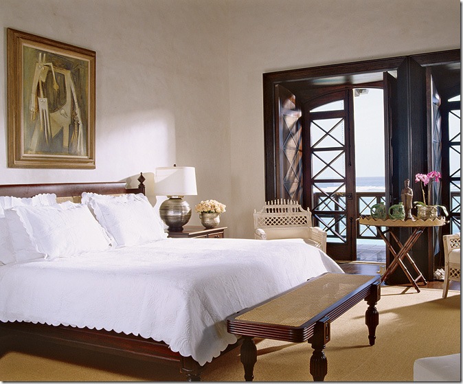
One of two master suites with a large wraparound terrace that overlooks the ocean and pool area.
House #3
This pavilion styled beach house is located on Mustique, the Caribbean island made famous by Princess Margaret, Mick Jaggar, Tommy Hilfiger and David Bowie - to name a few! The island has only 80 homes on it and not much else - no bars or restaurants - which insure there is no noisy touristy traffic to bother the upper crust of society who live here, albeit part-time. The designer of this home is London based, Grant White, who hails from South Africa. For this home, White paid homage to Oliver Messel, the famous English set designer, turned Mustique interior designer to the stars. Grant gave the house a strong West Indian colonial feel to it, more "austere and rugged" than "pretty" as some of Messel's designs tended to be.
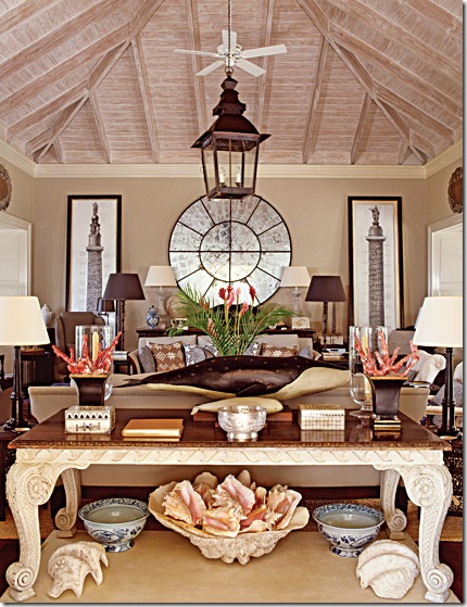
The owners insisted White use antiques and quality accessories even though this is a beach house, after all. The console is 18th century. The whales are 19th century museum models. An antique window on the back wall had its glass replaced with mirrors. The ceilings were all limed to give them a white washed effect. I love this room and would be quite happy here each summer!
Here is a close up view of the main living area.
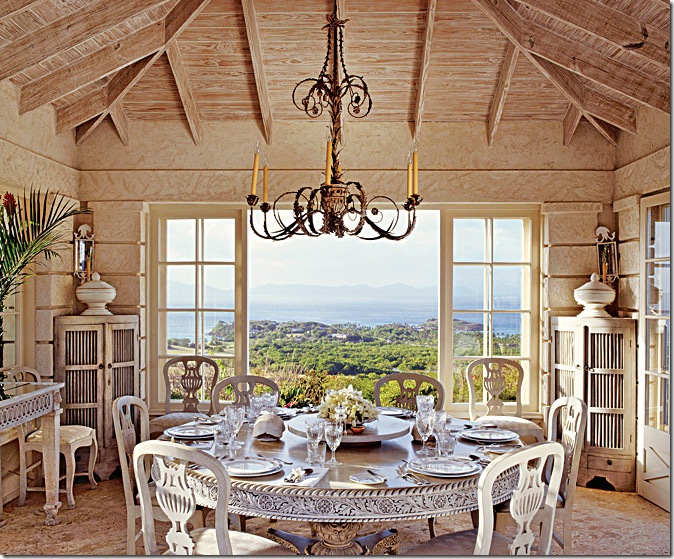
In the dining pavilion, White used a 19th century Ceylonese table. The floor is made of native shell.
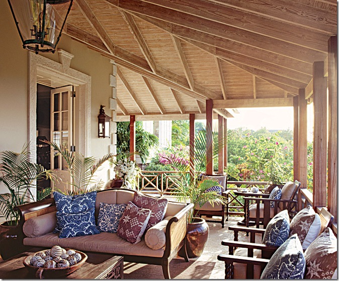
The main veranda is used day and night and is the most popular room in the house.
The master bedroom has floors of shell. The walls are concrete, not coral that is typically used on Mustique. Fabrics are from Jane Churchill.
This guest room has ethereal bed hangings with wooden angel wings! Notice the seahorse lamp.
These houses are just a small selection of designer beach houses around the world. While there was no expense spared in all these homes, there are ideas we can take and incorporate into our own, much more modest houses. All these homes were first published in Architectural Digest, a magazine that some find too extravagant and over-the-top to relate to. Yet, it is precisely by looking at the best that money can buy, that we can learn from these top designers and emulate them on a smaller scale.
For instance, the large round, antique window with mirrored glass shown in the house above is something that anyone can copy and claim their own. And what a wonderful idea that is! Another good idea is the large vertical prints on each side of the sofa, also, in the above house. The placement of these prints is an unusual, yet effective focal point that can be copied by anyone for a lot less money. All it would take is a picture and a trip to Kinkos, followed by framing at an affordable place like Michaels. I especially liked the painting of the blue and white tiles in the first house. With a stencil and blue and white paint, a person with a tight budget can have Portuguese tiled walls ala Michael Smith! Another element present in many of these houses are indoor lanterns. While antique lanterns from France can be costly, there are many lanterns for the outside that resemble the pricier antiques that can be brought inside to the foyer or family room for the same dramatic effect. Do you see any elements here that you would like to incorporate into your home? Is so, please share your ideas!
