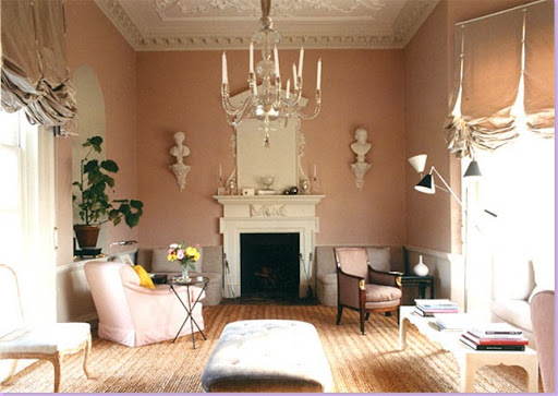
Interior by Veere Grenney: This is a pink a man could love! The blinds, with their voluminous use of silk taffeta, are to die for! The natural textured rug tones down what could be an over-the-top dressy room.
Veere Grenney, interior designer born in New Zealand, now practicing in London recently launched a gorgeous fabric line. As of now, there are only five patterns in his line - each in four color ways. The linen fabrics are very muted in the way that only the English know how to properly do. Available colors are an unusual choice in such a small line: Aqua, blue, brown and pink. Grenney, who at one time headed up the highly regarded company Colefax and Fowler, is apologetic about adding another fabric line to the already saturated market. Defending the launch, he says he only designed his line to fill a need for fabrics he could not find elsewhere. Regardless of the reasons, the fabrics are wonderful and hopefully he will soon be expanding the line into a full service one.
To see Grenney's London apartment, pick up this month's World of Interiors magazine. And, two fellow bloggers featured Grenney before moi - please be sure to stop by and read their impressions of him:
Studio Annetta and Desire to Inspire.
I could not find anyone in the United States who is carrying his fabrics yet but if interested, here is the information to get in touch with Grenney to place orders:
info@veeregrenney.com or
Tel: + 44 (0) 20 7351 7170
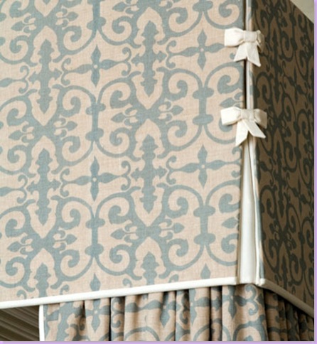
Fabric #1: Ferne Park in aqua. I love the way Grenney trimmed out the canopy here.
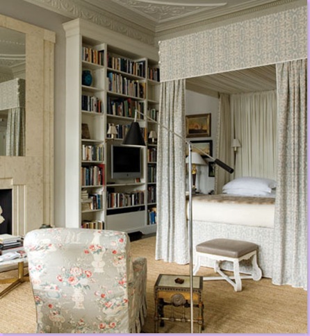
Grenney's London apartment: master bedroom with Ferne Park fabric in aqua. Robert Kime fabric covers the club chair.
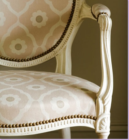
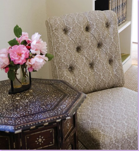
Fabric #2 - Soundess in pink.
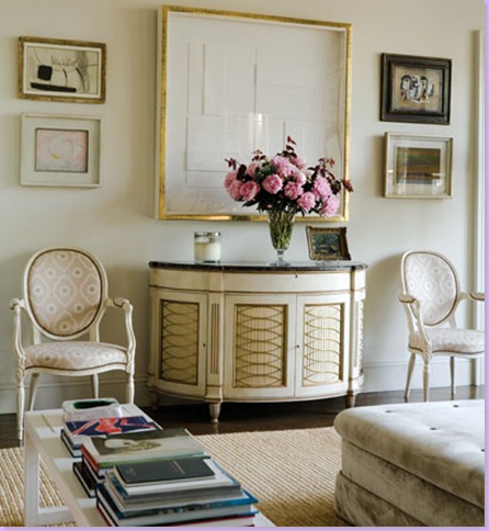
Greeley's apartment with chairs covered in Soundess. I love the demi-lune chest under the mirror and find it strikenly similar to a reproduction piece that has lately been featured in magazines, ad nauseam.
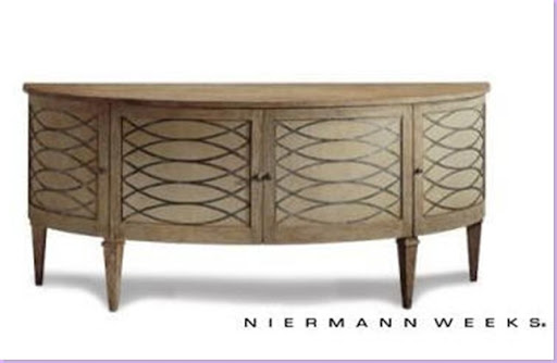
Niermann Weeks obviously took its inspiration from antique pieces similar to the one in Grenney's apartment. Whereas the NM piece is painted wood, Grenney's piece actually has a carved, raised, gilded relief over wood tooled in a pleated effect to create the criss-cross appearance. The detailing of the antique is exquisite. Additionally, Grenney's piece has a marble top.
Here Cindy Rinfert, designer from Connecticut, uses the NM chest in a two-toned finish, further reducing the elegance of the original inspiration piece.
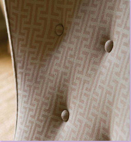
Veere Grenney's Fabric #3: Burley in brown.
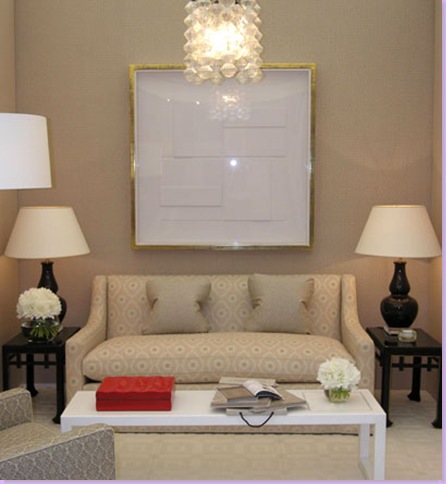
Here, Burley is in blue on the chair and Soundess is on the sofa in pink.
Fabric #4: Temple in pink. Grenney describes this fabric as a homage to David Hicks.
Here Grenney uses Temple as a wall covering in his dining room. Notice the scalloped wood trim on the chairs. The chairs are from a set 50 made in 1790 for a Viennese palace. Gorgeous!
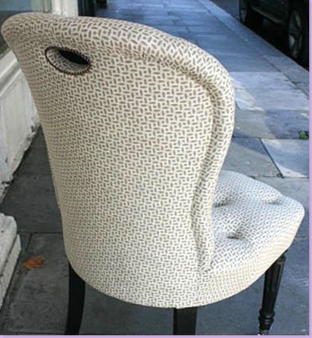
And Fabric #5 is Berrydown in brown. I love the way a "handle" is upholstered into the back of this chair .
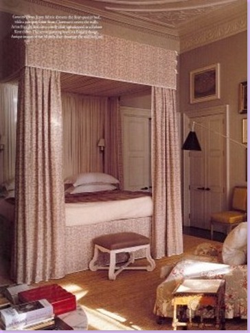
And finally, my favorite fabric of Grenney's is Ferne Park. Here is another view of his master bedroom with the bedding in Ferne Park. I would love to use this fabric in either aqua or pink in a new project. Anyone interested?
 One of my readers recently asked me for more information about the chair shown in designer Veere Grenney's bedroom and Veere's office was kind enough to share the source. I was afraid they were going to tell me that it was vintage or only available in the UK but it turns out the Bella Chair is from Twentieth Art & Design in Los Angeles! The 1940's Italian inspired chair can be ordered in your own COM (customer's own material) and even has a matching ottoman! You may not be able to hire Veere Grenney to decorate your home but you can order his chair! Ciao bella indeed!